
Pictures > Words > Numbers
3 ways to make finance easy

Let’s say you’re sitting down to review your financial results from last month. Which of the following tells you more about how things went:
A picture (presumably a chart going up and to the right)
A sentence (“sales went up a lot last month”)
A spreadsheet full of numbers (1.24, 1.55, 1.37, 1.74)
Hopefully the answer is obvious.
When it comes to analyzing data: pictures > words > numbers.
And yet here we are, tasked with interpreting the results of our financials (numbers) and turning those results into usable information to take action.
Every month, you’re asking reasonable questions like:
How profitable am I?
Am I going to run out of money?
Is my cash flow getting better or worse?
Are sales where they need to be? Expenses too high?
Instead of answers, you just have… numbers.
So what should you do about this?
One of the core principles for running a profitable business is: make things easy.
Simple can be harder than complex; you have to work hard to get your thinking clean to make it simple. — Steve Jobs
Here are 3 ways to keep things easy when managing your finances:
1) Simplify information
The standard profit & loss statement (P&L or income statement for newbies) was designed for accountants; and let’s be honest, it reads more like a CVS receipt than a children’s book.
In it’s raw format, most financial statements are over-engineered for the person trying to actually run the business (too many line items, too much precision, noise > signal).
When I’m working with financial data, I’m immediately doing 2 things: (1) rounding everything, everywhere; and (2) reducing the number of things I’m looking at (i.e. “zooming out”).
Rounding — Start by rounding everything off and up. Eliminate all decimals (you’ll thank me later). And start thinking in $100’s or $1,000’s — you don’t need $47,832.19, you need $48k. There’s a time-and-place for precision, but as a business owner with ops, sales, people, customers, etc. to deal with, this precision creates mental friction making your brain work harder without giving you any better information.
Zoom out — Next, reduce the number of things you’re looking at… by a lot. If your income statement has 200 expense lines, consolidate it down to 50; if you have 50 line items, consolidate down to 10. Ideally, everything fits onto a single page that shows you the whole picture in under 60 seconds. Revenue, gross profit, key expense categories, net profit, etc. I call this the “30,000 foot view” of your business. You can always zoom in later, just don’t start by zooming in.
Rule: if you can’t explain every line on your financial statements to a 10-year-old, it’s too complicated (p.s. I’m going to test this tonight with my kids).
I refer to this exercise as “condensing” your financial information, and it’s always the starting point when reviewing numbers.
2) Add charts, graphs, or visuals
Once you’ve simplified your information, the next step is to put it in “pictures.”
Reminder: pictures are the easiest method to understand data.
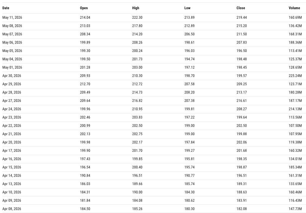
Here’s a bunch of numbers:
And here are those numbers in picture format:
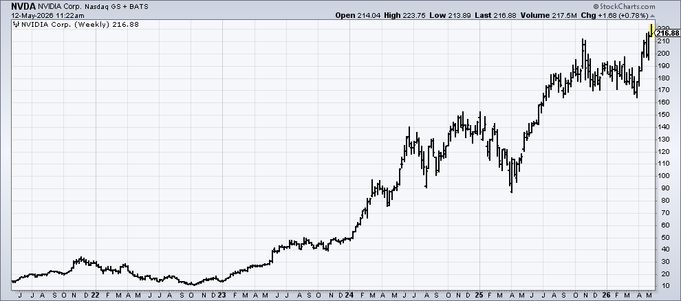
Cool. Looks like things are going well here.
This is why every public company in the world uses charts in their earnings presentations. Not because investors can’t read numbers, but because charts more clearly outline the story behind those numbers.
How to do this?
Take your simplified financials from above and build a small set of visuals that you review each month. I’d start with revenue trends, gross margin trends, cash, and profit. Four charts on a single page.
Pretty basic example, but it could look something like this:
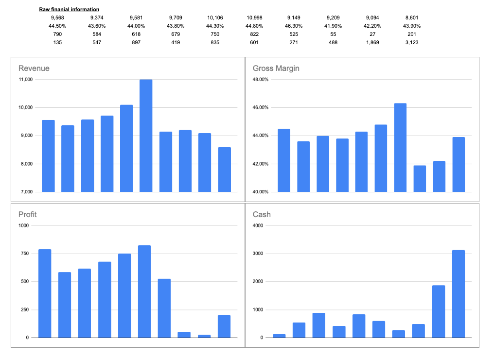
That’s an interesting picture and leads me to all sorts of questions as to what’s going on in this business.
Anyone who’s sat through one of my classes knows that we never look at a single point of data either, that tells you nothing. But 6 months or 6 years of data? Now we can really get a sense for the direction of the business.
Color-coding, trend lines, or monthly/yearly averages can add meaning to these pictures too. Especially for something like margins where you want to see what a baseline level of performance is.
You don’t need fancy dashboards to do this either, a basic chart in excel or sheets takes only a few minutes to set up.
3) Write the story
Most people skip this step and it’s arguably the most valuable of the 3.
At some point, you’ve probably read a business school case study. The typical format is: background information / context, then questions, then facts & figures. That context at the beginning makes the rest of the exercise infinitely easier to work through.
Have you ever tried this for your own company?
It’s astonishing how something so simple can be so revealing about your financial situation.
After you review your monthly financials, grab a piece of paper and write 2-3 sentences about what happened (just quick notes). It’s sort of like a journal entry for your business: What drove the numbers? Why did this big swing happen? What did you do (good or bad) in that month which could be showing up in the numbers?
Example: “April had record sales of $108k, up 10% from April last year. We onboarded 2 new salespeople earlier this year and they’re finally starting to see traction in new clients. Margins were flat because of those new hires, but if we keep seeing sales momentum, they should recover by the end of the year.”
That’s it… just 3 sentences. Keep a little log like this as part of your monthly financial review and it will deepen your understanding between the actions you’re taking (input) and the financial statements (output).
If monthly is too frequent, just try this once each year and with a little more detail (maybe a full page instead of 2-3 sentences).
By the way… This is exactly what Warren Buffett does in his annual shareholder letters. He gives you the numbers and walks through what happened to make them so. (Public companies do a great job of taking data and explaining it concisely, a valuable skill for business owners too.)
Putting it all together
Make things easy: simplify your numbers, turn them into pictures, write down the story.
Simplify = zoom out so you can can easily spot changes (signal)
Visualize = pictures > numbers; shortcut your tracking of major trends to stay focused on the most important thing(s)
Write the story = the context (words) to make sense of what happened (numbers)
No CFO or expensive accountant needed :) and this requires maybe 1-2 hours a month plus a willingness to change how you think about your financial statements.
Happy hunting (for profits).
TL;DR — Simplify your numbers (round off/up, reduce line items, zoom out), visualize the trends (charts and graphs!), and write the story (2-3 sentences of context). Do these 3 things with your monthly financial review.
P.S. if you find this content valuable, give this article a “like” and share it with someone! help us spread the word!
Trying to grow this Substack slowly — please do consider subscribing it means a lot for me✨